April 9, 2011 report
US energy use chart shows we waste more than half of our energy

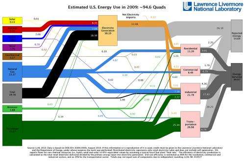
(PhysOrg.com) -- This flow chart of the estimated US energy use in 2009, assembled by the Lawrence Livermore National Laboratory (LLNL), paints a pretty sobering picture of our energy situation. To begin with, it shows that more than half (58%) of the total energy produced in the US is wasted due to inefficiencies, such as waste heat from power plants, vehicles, and light bulbs. In other words, the US has an energy efficiency of 42%. And, despite the numerous reports of progress in solar, wind, and geothermal energy, those three energy sources combined provide just 1.2% of our total energy production. The vast majority of our energy still comes from petroleum (37%), natural gas (25%), and coal (21%).
That percentage of oil illustrates that by far our biggest problem - or area of improvement - is transportation. As the chart shows, the transportation sector is the single biggest consumer of energy, accounting for nearly 40% of the energy consumed by the four sectors (along with residential, commercial, and industrial). In comparison, just 16% is used for residential use. And while the residential, commercial, and industrial sectors waste about 20% of their energy, the transportation sector wastes a full 75%, making it just 25% energy-efficient. Part of this waste is due to the fact that cars are an inherently inefficient way to move people around, since much of the energy must go into moving the massive car and not simply the person.
The chart emphasizes the importance of using alternative methods of transportation - walking, biking, public transportation, or anything else that moves more human and less steel. Unfortunately, due to developers building sprawling suburbs to satisfy Americans’ demands of large homes and yards, many people now find themselves miles from the nearest grocery store and have no choice but to drive everywhere. To illustrate how transportation consumption and waste dwarfs residential consumption, a blog post on Treehugger notes that “building suburbs of Energy Star houses with solar panels on top is a complete waste of time.”
With that being said, comparing the 2009 chart to the 2008 chart shows that we’re making progress. The total amount of solar energy production increased from 0.09 to 0.11 quads, wind energy increased from 0.51 to 0.70 quads, and geothermal increased from 0.35 to 0.37 quads. (The amount of energy in one quad is equivalent to that produced by the burning of 36 million tonnes of coal.) Overall, the US consumed less total energy in 2009 (94.6 quads) than in 2008 (99.2 quads) as well as any year back to 1999 (97 quads), which is the first year for which LLNL has a chart on its website. There were even three years during the past decade when the country consumed more than 100 quads. In addition, the total waste in 2008 was 57.07 quads, compared to 54.64 quads in 2009 (though the percentage wasted was about the same).
Although there is vast room for improvement, if the US can employ a combination of decreasing consumption, increasing efficiency, and increasing the role of renewable energy sources, hopefully we’ll continue heading in the right direction.
More information: via: Lawrence Livermore National Laboratory and Treehugger
© 2010 PhysOrg.com


